Prototyping for product managers
Many of the CanvasFlip users are product managers. We recently rolled out an interesting survey where we wanted to understand from our users their use cases based on their profession.
It is interesting to understand how prototyping is different for a product manager when compared to a designer or a UX researcher. Concluding from that the most important derivations — what ideally should a product manager contribute to in the process of prototyping.
Prototypes are the ideal tool to launch important discussions early in the development process when failing fast won’t jeopardize budget or timeline. This article goes on to talk about how a prototype eases the workflow of a product manager and at which points should he contribute the most.
Why prototyping is important for product managers?
1. Cuts down on the risk of misinterpretation
Teams across the globe have tried the 50-page requirement approach. And clearly, with experience we can say that it is not the best way of conveying all the details of a complex digital product. Readers either quickly get bored or even worse, misinterpret what is written.

Prototypes, on the other hand, expand each user story into a tangible part of a system. If user stories express task-level goals, then prototypes help us see the horizontal feature set (breadth) and vertical feature set (depth) required to fulfil each story.
2. Faster iterations
If you’ve ever created a formal requirements document, you know how much patience and time is requires. Validating those requirements document eats up even more time. Needless to say, for precise feedback, each part of the document has to be carefully studied. In case changes are requested, updating the document becomes even more tedious. The cycle of documentation just becomes too expensive.
Prototypes, on the other hand, are much faster to create. Instead of reading requirements, people are experiencing them. Content is easier to navigate, and the taxonomies are crystal clear. If changes are required, the reviewer can comment directly on the affected part of the UI. Far more efficient than wading through documentation that requires serious imagination.

3. Early validation of concepts
We all know the pain of iterating on the product once it is developed. We either spend lots on it or ignore usability issues totally. A better way to go about the product development process is validating concepts early in the project — when your developers have not written a line of code at all.
For all our projects we validate or more importantly invalidate the feature and it’s usability in the early stages — using CanvasFlip of course!
Very recently we came up with the magic URL feature in CanvasFlip, wherein you get a social link that use can share across channels to get user recording and UX insights in your account. To validate this feature we shared a prototype of the same on Slack. Here’s the heat map —

3. Improves quality of technical feedback
Often developers have a lot to contribute in the flow and architecture of the app/website. But, by the time they are introduced to the product it’s too late for feedback. Also, documentation is not the best way of communication between a designer and developer.
If developers and designers both speak the common language of systems interactions, why not communicate requirements in that medium?

Even a lo-fi prototype can help developers quickly see dependencies between elements and interaction models. An early evaluation might even prompt developers to suggest better solutions the designers never even considered. All before anyone ever opens Photoshop, Sketch, or a code editor.
4. Better stakeholder buy-in
Stakeholder buy-in is often tricky.
They need the project to fulfill business needs (e.g. increase revenue or NPS score, decrease support call volume, etc). For them, user needs are just a means to the end.
When focused on the bottom line, it’s easy for stakeholders to treat requirements as a laundry list. After all, they can’t see the conse- quences of their requests. Why not add another feature (or feature set) if it makes the product more robust?
The problem is that the product vision isn’t tangible. Everyone sees the product differently, and therefore reacts differently.
A prototype opens their eyes. The laundry list dissolves, and the prod- uct comes into focus. The consequences of additional features are immediately real for everyone from a junior designer to a Product VP.
Product manager’s contribution to prototypes
A product manager is the head captain and his most important input to prototyping is setting the expectations right and carving the path for the team.
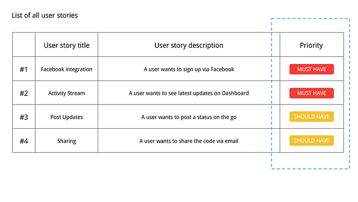
- List all user stories
For any mobile app that you are building, there are a list of things a user can do on it. Here’s the template we follow for user stories and assigning priority to them.

2. Prioritise user stories by risk
Prototyping user stories such as “accessing terms and conditions” is a very low risk user story. Devoting time and efforts into this is not justified. Hence, for prototyping, prioritise user stories involving user input and processing of user submitted data. This is where the most risk often lies and a clear user experience is most required.

3. Prototype the riskiest user story
Now that you’ve identified the high risk user stories, it’s time to visualise them through your prototype.
When prototyping requirements, use low or medium fidelity. You want designers and developers to better understand how the specs might manifest themselves as interaction models and content structures.

